I was disheartened to find out a picture with visible CHROMATIC ABERRATION won POTD a few days ago, and while the picture was indeed quite good I strongly believe CA does not a perfect picture make! Am I the only one to think this?
I have found out on HDRCreme that a score of 10 is the norm rather than the exception which is nonsensical when you think about it, perfection should be hard to achieve, not readily achieved. I have found scoring of my pictures to be actually fair.
Lastly, this is not an arrogant attitude on my part, I just disagree with the general scoring on here, I have indicated my scoring guidelines on my profile, subjective as they may be, and I hope you understand my point of view.
Let's make HDRCreme a site where we push each other to produce our best work!
25 Jan 13:22
bjosted
9
25 Jan 13:31
eduardo_kiehl
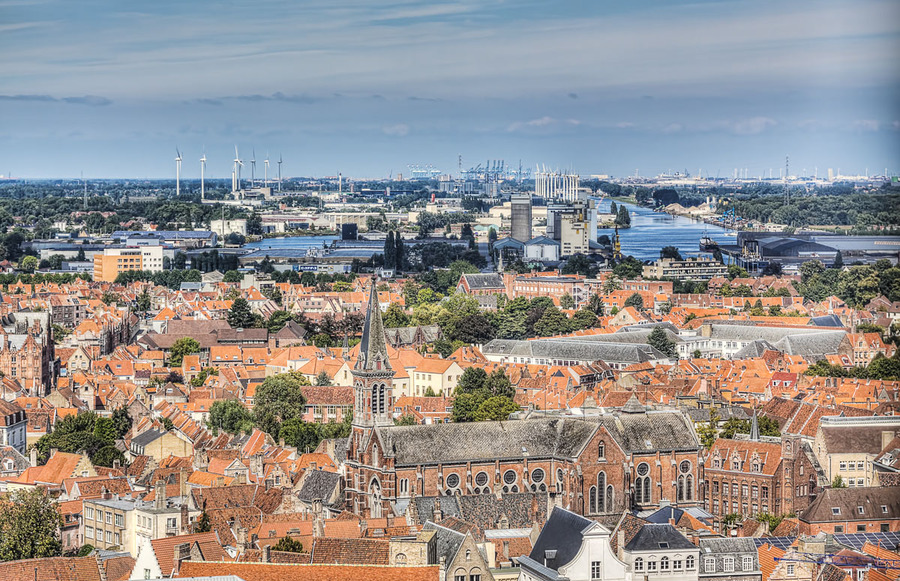
great view and photo
25 Jan 13:44
sirenja
I see what you mean, and sadly I have to agree with you that it seems to be some "friends" woting going on in here...I dont know what photo you are refering to that won, but we still have to respect eachoter, and ours different opinion on what we think lo
25 Jan 13:46
sirenja
looks great or not! :) Your photo get a 9 from me, its a bit too bright in the front I think.
25 Jan 14:00
jorgehdrbrazil
I have to agree with you too. People are voting too many 10! I think we should go 10 only when the picture really deserves it. Only in very special cases!! For me, NINE is an excellent score, and EIGHT is also a very good one.
25 Jan 15:31
randall.lohr
According to your scoring, this shot is busy, lacking a focal point and your horizon is not square with every building in the shot. Your critiques vary from person to person and go beyond fair to vengeful.
25 Jan 15:34
randall.lohr
also since you do not allow downloads, you judge on hyper-magnification of downloadable images, but refuse to even allow a normal downloadable original. HYPOCRITE
25 Jan 16:02
tamson1
I agree with Randall ...
25 Jan 16:43
eduardo_kiehl
I agree, to many 10s
25 Jan 16:44
sanz3jo
The sky look flat but that is what mother nature bring to you on this day, so you can't fix it. While I wait for your best work.
25 Jan 18:15
flipd1
Hey everyone, the download button is not needed. Here is how you blow the picture up. First, click on the picture. Then hold down the CTRL Key and hit the + key. it will make your entire screen magnified.
25 Jan 18:28
flipd1
@Eric, The first criteria you have is you would hang it on your wall. With that said, there are many pictures that are on here that I would hang on my wall that have flaws on them. Even things like C/A if the C/A is barely visible. Also there is stuff
25 Jan 18:29
flipd1
stuff that I would NEVER hang on my wall like the dead carcass that Randall put up the other day. As well as a dirty doll, a toilet, a dilapidated house, etc. But all of these motifs have won POTD at one point or another. Point being all of the picture
25 Jan 18:31
flipd1
all of the pictures mentioned in the last category were good enough for me to vote a 10 because of the excellent process.
25 Jan 19:43
anonymous
9
25 Jan 20:27
miltonv
9
25 Jan 21:13
adrian_adrian_evans.com
8+ looks a bit flat - is it a midday shot? Nice pov
25 Jan 21:51
pandarino
bad process for the sky
25 Jan 23:51
ksaul1
8+ , Not real sharp, maybe if a tripod was used, a cable release and mirror lockup might also help, hang on the wall rating, 6
26 Jan 01:29
dalematt
I had a professor who refused to give A's because A's belonged only to geniuses. He felt that he was the only genius at the university! I score photos according to what I like/dislike. In this photo, the foreground looks washed out. The rest is very g
26 Jan 03:09
josephc
i like it, agree a little more contrast in the foreground.
I was disheartened to find out a picture with visible CHROMATIC ABERRATION won POTD a few days ago, and while the picture was indeed quite good I strongly believe CA does not a perfect picture make! Am I the only one to think this? I have found out on HDRCreme that a score of 10 is the norm rather than the exception which is nonsensical when you think about it, perfection should be hard to achieve, not readily achieved. I have found scoring of my pictures to be actually fair. Lastly, this is not an arrogant attitude on my part, I just disagree with the general scoring on here, I have indicated my scoring guidelines on my profile, subjective as they may be, and I hope you understand my point of view. Let's make HDRCreme a site where we push each other to produce our best work!
9
great view and photo
I see what you mean, and sadly I have to agree with you that it seems to be some "friends" woting going on in here...I dont know what photo you are refering to that won, but we still have to respect eachoter, and ours different opinion on what we think lo
looks great or not! :) Your photo get a 9 from me, its a bit too bright in the front I think.
I have to agree with you too. People are voting too many 10! I think we should go 10 only when the picture really deserves it. Only in very special cases!! For me, NINE is an excellent score, and EIGHT is also a very good one.
According to your scoring, this shot is busy, lacking a focal point and your horizon is not square with every building in the shot. Your critiques vary from person to person and go beyond fair to vengeful.
also since you do not allow downloads, you judge on hyper-magnification of downloadable images, but refuse to even allow a normal downloadable original. HYPOCRITE
I agree with Randall ...
I agree, to many 10s
The sky look flat but that is what mother nature bring to you on this day, so you can't fix it. While I wait for your best work.
Hey everyone, the download button is not needed. Here is how you blow the picture up. First, click on the picture. Then hold down the CTRL Key and hit the + key. it will make your entire screen magnified.
@Eric, The first criteria you have is you would hang it on your wall. With that said, there are many pictures that are on here that I would hang on my wall that have flaws on them. Even things like C/A if the C/A is barely visible. Also there is stuff
stuff that I would NEVER hang on my wall like the dead carcass that Randall put up the other day. As well as a dirty doll, a toilet, a dilapidated house, etc. But all of these motifs have won POTD at one point or another. Point being all of the picture
all of the pictures mentioned in the last category were good enough for me to vote a 10 because of the excellent process.
9
9
8+ looks a bit flat - is it a midday shot? Nice pov
bad process for the sky
8+ , Not real sharp, maybe if a tripod was used, a cable release and mirror lockup might also help, hang on the wall rating, 6
I had a professor who refused to give A's because A's belonged only to geniuses. He felt that he was the only genius at the university! I score photos according to what I like/dislike. In this photo, the foreground looks washed out. The rest is very g
i like it, agree a little more contrast in the foreground.